Chaos Killed the Dinosaurs - You'll Find a Way

Music Video

Album Cover

Website - click image to see full website

Friday, 24 January 2014

Arianna Question 3: What have you learned from your audience feedback?

We tried to get as much audience feedback throughout the project as possible. We decided that our target audience would be British females aged 15-45, with our secondary audience extending to males of the same category and tertiary being foreign non-English language speakers. However, in the midst of our project we realised that targeting the tertiary audience would be unrealistic with a small independent record label. We decided to focus on the primary and secondary after this thought.

We needed to take into account Katz and Blumler's theory of the key uses and gratifications of media products when trying to target our audience. Our video was definitely entertaining, but I feel that it would have been difficult for the audience to identify with the characters in it. However, this provided an alternative interesting effect as it could have been considered confusing and intriguing. It definitely enhanced social interaction, with people talking about the music videos for days in school. Some went as far as saying they “want to create [their] own music video now”.  Finally, I think the video definitely provided an escape from daily life. From watching reactions in the screening we held, everyone seemed hooked on the narrative.

As a group, we created an online questionnaire with SurveyMonkey, an online web tool, as it was an easy way of getting feedback from friends in the form of quantative data and collating it all in one place. We all shared the link via Facebook and we received over 50 responses. Social media platforms were extremely useful when targeting our young, modern and technological audience. Here is a video I created going through the results:


Alice and I also held a focus group with friends who would be in both the primary and secondary target audience. This is a video of their responses to the questions we asked:


After learning about Stuart Hall's theory of 'preferred and negociated meaning' I understood that all of our texts are polysemic. There is no one way of looking at things which is why every audience member interpreted the music video differently. Our hospital set up was inspired by old depictions of a psychiatric hospital, for example that in the film One Flew Over the Cuckoos Nest. We had to be wary that with negotiated meaning, this could be interpreted as offensive. However, from our audience feedback we established that this was not the case.
It was necessary to get audience feedback on our ancillary tasks. Again, social media was a perfect was of doing this. I sent an image of the album cover and a link to the website to a few friends and this is an example of the feedback I received:


Overall we received a lot of positive feedback on our video, but there were also some improvements to be made.

Positives:

-        The hospital was interesting and the narrative was effective
-        Faced paced editing
-        Editing and effects of the dancer
-        Band performance
-        The projection of popular culture references worked well
-        Narrative and lyrics worked well together

Improvements:

-        Narrative not always fully understood
-        Projection not always visible in background
-        More shots of other members of the band

Arianna Question 4: How did you use new media technologies in the construction and research, planning and evaluation stages?

Research and Planning:

New media technologies were essential throughout every stage of the project. In the research and planning stage we kept in contact using social media. We had a ‘Music Video’ group message on Facebook, on which we could discuss ideas and plan meetings and shoots. We also had conversations over Skype when planning things at length. Skype was perfect for when we needed to show eachother flat plans and album art sketches.


Youtube was particularly vital in this stage as it was our means of finding a song. We listened to some other songs by Santigold and would not have found ‘You’ll Find a Way’ without Youtube’s recommended videos. We also used Youtube when looking for inspirations for our video. This is how we found the Panic! At The Disco video which was our main inspiration for the hospital. Although they weren’t successful, we also used Spotify and Itunes to try and find a song to use.
Web.20 allowed us to go to website such as Amazon an eBay to purchase items needed for our shoots, for example the straightjacket, needles and nurse outfits.

Construction:

Within the construction process we came across lots of technologies and techniques that were very new to us. We were given cameras that we had not worked with before so they took some getting used to. We used the Canon 5D Mark II for our first shot as we realised it would be the best for an intended focus pull.  We shot everything else on the HVR-V1E, another unfamiliar camera to us. We were also new to using the lighting desk to control the Arri Flex studio lights. We were able to reposition them, adjust the strength and use coloured filters to our advantage, for example in the grunge set up.


We used Adobe Premiere Pro CS5 when editing our music video. Although we were familiar with this software after working with it last year, the style of editing was completely different and there were effects which we had to learn how to do, for example making the dancer look as though he was disappearing and also make him dream-like with the grade.  We really upped the contrast and saturation, also adding an echo effect. Here is a short clip of some original clips compared with their graded versions:


We used a flash-based website (rather than HTML based) called Wix to create our website. It was easy to use and allowed us to make a website which was visual and interactive:


A massive benefit of Wix was that it allowed us to have links to all our forms of social media. There were essential for targeting our young, modern audience. Here is a video I created going through all of the links:


We also created a Facebook page which was linked to our website:

We also ensured to included lots of links to ITunes on the website. After doing research I found that the sales of CDs are declining and there is a bigger focus on digital downloads in the modern age. Here are a few of the headlines I found online:


When creating our album cover we used Adobe Photoshop. Like with Premiere Pro, we were familiar with the program but needed more advanced effects and techniques for this project. For example, when editing the images of the band members on the inside panels, we used a tool called the Skin Smoother, which gave the images a more professional sheen. We also had to edit everything within the digipack template.

Evaluation:

Web 2.0 was essential throughout the evaluation. It allowed us to find necessary tools such as Camtasia for screen-capturing, Voki for speaking avatars and website which can produce GIFs. It also proved useful when getting our audience feedback. We used a website called SurveyMonkey to create an online questionnaire. It was our most successful form of feedback as we received over 50 responses.  We also used social media as a means of getting feedback, asking people questions via messaging on Facebook.  A Facebook event was created to promote our screening and, even after the event, we were able to use it as a platform to get people to answer our SurveyMonkey Questionnaire.

Thursday, 23 January 2014

Alice Question 1: In what way does your media product use, develop or challenge forms and conventions of real media products?

Our final music video uses, develops and challenges typical forms and conventions of music videos, particularly because we have a girl band, which is unusual with our indie pop music genre.

Conventions of our music video:
I have created an annotated version of our music video on youtube, outlining the conventions of music videos, much of which fits in with Vernallis theory, that we have used in our own.


As mentioned in the annotations video above, the themes of films used in our projection allowed us to represent the lead singer in an interesting way. The audience may not understand every reference but the relationship between the projection and the music video may be interpreted in different ways by the audience. Here is a video of our whole projection reel:


Challenges:
We are an indie pop band, which is not a mainstream genre, and also not often associated with a female band. Although there are female fronted indie bands, it is often the case that the band members are male. We challenged this as every member of our band is female, but we also challenged the typical roles of female artists, by not being overly feminine, meaning we had to think about our image and branding carefully. We decided on deco-grunge clothes in order to ensure we seemed feminine, but with an edge; this included denim shorts, black dresses, lots of chains, and chunky boots, which became a significant part of our outfit. It is clear we are not only marketed through our identity, but also the music, which is key to our band. 

Here is an image showing the outfits we decided on
in one set up of the video; dresses, and chunky boots. 
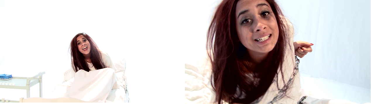
From looking at other female fronted indie bands, we took some of the inspiration for our infinite white setting in the hospital scenes, from Florence and the Machine's video for 'You've got the love,' in which she uses infinite white to represent a dreamlike set up. 


The gif on the left shows a clip from You've got the love which we took inspiration from, and the gif on the right is a clip it gave inspiration from. 


We took inspiration from the start of the project in order to influence our set ups within the video, our performance and our style. We took inspiration from 'This is Gospel' by Panic at the Disco for our hospital scenes, and looked into other female artists to influence our attitude and style.


The gif on the left shows a clip from This is Gospel that we took inspiration from and the gif on the right is our scene that was infuenced by it. 


Our music video was for a debut album for our band which meant it was important to stand out, and hook the audience. We felt our image, and the name of our band was quite catchy and made us seem 'different' to other bands of the indie genre. Our name 'Chaos killed the Dinosaur' is a reference from a film Heathers, associated with a girl that spirals out of control, and this reference fits in with Arianna and her role as the crazy lead singer.

Website:On our website we followed conventions typical to most artist websites and we took inspiration from other artist websites, especially Lorde and Lady Gaga. 

The image above is of our website on the left, and Lady Gaga'a website, that we took inspiration on the right and the conventions of websites followed on each.


Conventions of artist websites followed on our website:

  • Band member profiles
  • Tour dates
  • Social media links - facebook, twitter and instagram
  • Photo albums
  • Downloads
  • Competitions
  • News and info 
  • Consistent branding colours
  • Album cover and pre-order links available on every page
The website was designed on Wix, a flash based website rather than a website built with HTML code, which meant the website was easy to create, and navigate but at the same time limited our possibilities with the website. Our branding and image continued onto the website, with our black and red band colours.

Album Cover:
To decide on what we wanted the album cover to look like as a group, we first all sat down with pictures we liked and that inspired us, along with other album covers. As a group, we wanted something unique and different to conventional female artist album covers. Typical female artist band covers usually have a front cover image of  the whole band, however ours is a close up of the lead singer underwater. 


On the left is a gif of the front, back, and inside covers of our album cover, and on the right is images and other album covers we took inspiration from. 


Conventions followed:
  • Band name and album title down the spine
  • Song names on the back
  • Album and band name on the front cover
  • Band colours creating branding
  • Institutional info including barcode, record company label, website
  • Bold, eye-catching photos
On the back of our album cover we used a bold photo of Arianna, our lead singer, topless but without sexualising her body. We decided to take a non-sexualised photo due to lessons we had in class on how females are portrayed in the media, and we wanted to challenge the convention that females are portrayed as 'sexy' and very 'feminine'. The water theme was consistent across the album cover and we felt the neutral expressions on all members of the band stood out (as a debut album must) and would catch a viewers attention. 

Alice Question 2: How effective is the combination of your main product and ancillary texts?

I think that our combination of our main product and ancillary texts works effectively and brands our band, creating an explicit artist identity and creating synergy across our 3 texts. We wanted our music video to introduce us as a new indie band, and show the audience that our lead singer was the lead singer, dominating the other band members. We wanted our music video to help promote our band website in order to bring in the audience and generate revenue through the website, making it important to create a consistent brand across an integrated marketing campaign.

We took influences from other bands with a strong female lead, such as Florence and the Machine, Paramore and Siouxshie and the Bandshees. 


With Arianna being the lead singer, we wanted to create her identity as the crazy, outgoing band member, who almost outshines the other members. This was done through her choice of clothing; although similar style, always stood out in red. It was also achieved by Arianna having more screen time than any other member of the band, to show that the band are clearly backing. The band identity, facing Arianna as the lead singer continued on the album cover and the website, as the album cover featured Arianna on the front and throughout our albums on the website, in the majority of photos Arianna stood out from the band members through her poses and outfits.


This pictures show that Arianna stood out as the lead singer, with a wild side to her in our studio shoots (left and right photos) as well as in our promo shoot (middle photo)

Our band logo and name was another crucial part of our band representation. The band name 'Chaos killed the Dinosaurs' is unusual, and taken from the film Heathers, about a girl who meets a rebel that influences. This can be associated with our edgy lead singer, and the audience may have seen the film, helping them to connect with the band through pop culture. Our band name influenced out logo, as we have a washed out image of a dinosaur in the background creating synergy with the name. The colours red and black also expand onto the logo, our branding colours, used in the music video and on the website too.
 
As a group we came up with the name Revolutionary Records, for our record label name and designed a logo for it which we then added to the bottom of every page on our website, and featured on the back of our album cover, creating synergy between the ancillary texts.


Throughout our A2 lessons, we have learnt that audience interactivity is a crucial part of any marketing campaign to engage them. We therefore provided the audience with a number of opportunities to get involved with our band including; links to twitter, instagram and facebook on our website, competitions and the opportunity to buy merchandise. Social media plays a huge role in our campaign, so we ensured there were social media links on every page of the website to target our audience. Online platforms were exploited as people as less people buy hard copies of music, CD's, due to the availability of online platforms such as Spotify, soundcloud and iTunes. We therefore integrated an iTunes link onto our website to help create another money making opportunity.

This chart shows what has been making the most revenue out of physical and digital music, and concerts. It also shows predictions for what will happen up to 2017. It estimates the most money will be made from live music.

Wednesday, 22 January 2014

Alice Question 3: What have you learned from your audience feedback?

Audience feedback has been gathered throughout the development of the project and it has helped us in decisions relating to our music video, album cover and website. It also helped us after the project in realising that our audience had different interpretations of our music video. 

Our target audience was females aged 15-45, who are looking for something alternative from  mainstream pop music. The target audience is quite a wide age range, because we thought our representation of females would appeal to women of different ages, and our campaign was structured around our target audience.

To gather audience feedback, we used social media platforms to target modern audiences and get them interested in letting us know what they think about our music video. This included posting our survey on twitter and facebook, posting our video on social media sites, interviewing focus groups and we also had a screening at our school where we handed our questionnaires, and all of these methods helped us to gather information on audience feedback.

Screening 
We held a screening in the Seward Studio and people filled in questionnaires our group had handed out.We handed out the questionnaires to 1 person in every 5, so that the results were not biased, and we received really useful feedback that has helped me reflect back on the project. We also filmed a few members of our school who visited the screening who answered a few questions about our music video for us.


I also created a survey on a website called surveymonkey, which I posted on social media websites through my own page, and the bands facebook and twitter pages and people filled in the online survey. The surveys questions allowed me to gather both qualitative and quantitative data:


 The overall rating for our video as a whole was 8.7 out of 10, which I was very happy with; the high rating shows that our video was successful in engaging with an audience, and that the audience reacted positively to the video, giving it a high rating, that I did not expect, suggesting perhaps we were also successful in marketing our target audience.

 This pie chart shows the answers for the question 'What do you think was the best technical aspect of our music video?' and it clearly shows that 50% of people thought the editing and lighting was the least favourite, perhaps meaning we should have put it on more time focusing on the lighting we wanted in our music video.


 One of our survey questions was a question about the genre of our song, because there was room for interpretation for the exact genre of our music video. We decided it was indie pop, but the data from our survey shows that the audience's view on the song genre differed dramatically, which may have been something which affected the marketing of the campaign, because we marketed our band and debut song as indie pop.

The screening with questionnaires, along with an interview with A2 students and our questionnaire, we were able to get a range of audience feed back. Here are some conclusions of our video, with quotes next to some points of some other members of our target audience I interviewed: 

 Positives of the video
  • The editing of Kai and the effects used on the dancer
  • Camera angles and shot types
  • The way that shot speed and style matches the style of the music
  • Narrative and lyrics worked in harmony
  • Performance set up
  • Narrative and performance working together
  • Fast paced, montage style editing
  • The band branding and artist identity "quirky"
  • Hospital scenes were realistic "The bit taking the blood and the needle going in was gross" 

 What could have been improved?
  • Clearer narrative
  • A more defined narrative, that is not left as open at the end
  • More performance shots of members of the band "worked well but made it seem like the band was just backing, so you expect the next song to also on focus on the singer"
  • Better grading
  • More involvement of other band members in hospital scenes
  • Could have made the projection shots clearer/more frequent "I don't think I have the concentration to notice everything on the projection" 

Not only did I interview members of our audience about our music video, but also asked a few members of our female target audience to comment on what they thought of the website and the album cover, and what we could have improved. 


To find out what an audience member thought about the website, I interviewed a female, aged 24 and asked her what she thought of the website.
I have turned her response into the little avatar on the right, and when you click play it will let you know what she thinks.


Quotes on album cover:
"Unusual, but really striking"
"The image on the cover underwater catches my attention, but would not make me think the album was for a band"
"I like that the water theme runs throughout the CD"
"I think the front cover is stunning, but the back cover could have something a little more eye catching to make it stand out just as much"

Ella Question 1: In what way does your media product use, develop or challenge forms and conventions of real media products?

In general, our products predominantly develop on current conventions for both the indie-pop genre and music videos in general. Occasionally our music video as well as our album and website challenge these conventions. I have further demonstrated this by using Goodwin's Theory as a starting point to explain our use of individual conventions, and using examples from our products and influential products as references. I have chosen to use Goodwin's theory because i found it a useful tool for analysing music videos earlier on in the year.

1. Genre


"Music videos demonstrate genre characteristics"


Our video is of the indie-pop genre, and we have tried to make this clear throughout by using genre conventions regarding representation of the artist, styling, performance and the concept of our music video itself. The indie genre has fewer conventions than most other genres, maybe because it has been formed for an audience looking for something that was not previously offered within other genres, and that developed after the industry identified these unsatisfied uses and gratifications. (for various uses and gratifications) However, our music video is a being a hybrid of indie and pop, and so it takes occasional conventions from the pop genre, although considerably less so than in videos made for UK Top 40. 


A. A strong convention of pop music videos is several costume and make-up changes. This is a convention that we have used as you can see below, and an example of this in Lily Allen's "hard out here" (bottom image). However, in the urban dancer scenes, the lead singer is not in a different costume, she is in fact in the same outfit but how she imagines herself to look in the hospital set-up (i.e. make-up perfect, hair combed etc.). 


B. Another convention that we have used is having young artists to appeal to the young target audience. This is also appropriate to the indie genre, the artist is not a group of singers (such as little mix below), but a band playing instruments. However, we have definitely challenged a convention of both genres, by having an all girl group playing instruments. This is uncommon in all music videos, usually the singer is female and the band male, or it is an all female vocal group. 


C. A convention of pop music videos are that they are performance based videos (such as Single Ladies below). Indie music videos are often either full performance, narrative or concept (such as Breezeblocks below). This is a convention that we have developed, by combining our performance with concept.   

The hospital and dance set-ups are the
concept half of the video.

The performance set ups make up the other half of the video,
these are the projection and the grunge set-ups. 


D. Most pop videos have bold bright colours throughout, and vibrant colourful sets (see Little Mix - Wings below). This is one of the ways in which our video is indie as opposed to; we have challenged this pop convention. Our video perhaps fits the indie genre even more here; there is a strong grunge feel to one performance set up, and the second has a projection of films and TV in the background, something which has not been done before and challenges convention. 


This picture shows 4 stills from our projection set up. The films projected are (clockwise from top left) Girl, Interrupted, Fight club, Fight club, Kill Bill. 

2. Links


" There is a relationship between lyrics, music and visuals."


We have definitely used this convention frequently within our music video. We have tried to be innovative and suprising with our usage; sometimes the relationship emphases a lyric whereas other times it is contradictory, even sarcastic. This is particularly appropriate for a concept music video, because it means that different members of the audience, watching to fulfil various needs, will pick up on different links and interpret the music video differently. 


(This is a recording of a power-point presentation using Camtasia. I chose to use these softwares
because neither Slide Share nor Prezi properly displayed GIF images.)

There are also links between the music and the action in our video. For example, in the bridge of the song the pace slows down, and it is in this bit that the lead singer sees the dancer the most, there are cross dissolves between the clips and the sequence there feels more dream like. This is juxtaposed by the choruses, in which the fast paced editing and strong actions reflect the nature of the music. 


3. Visual Hooks and Visual Style


"The demands of the record label include the need for lots of close-ups of the artist (visual hooks) and the artist may develop motifs which recur across their work (a visual style)."


N.B. These are our four different set-ups


From left to right: Projection, Hospital, Grunge, Dancer/Urban/Brick Lane

This is a convention that we definitely used a lot throughout our music video. There were many more close-ups of Arianna than there were of the other band, yet motifs such as glitter ran through-out. We also used beauty shots of Arianna in all 4 of the set ups. However, there was a difference between the connotations and the effect on the beauty shot in each. In the projection and grunge set-ups, the beauty shots were for traditional reasons; to present the artist and to show her individual style and emotions whilst singing in a way that is aesthetically pleasing. However, in the hospital scenes, the beauty shots used challenge convention. They are used to connote the opposite of beauty; to depict the main character as desperate, crazy and erratic, to demonstrate the pain and confinement she is experiencing, dependent on the individual interpretation of the viewer. Finally, in the urban dancer scenes, the lead singer is in the same costume as before. However, her make-up is perfect and she looks considerably more stylised. These beauty shots depict her how she imagines herself to look. 


These are examples of conventional beauty shots used throughout
our video in the performance set-ups
These shots are similar to conventional beauty shots, but the effect
is different

An motif example of a motif that runs throughout our products is the blank facial expressions. Whilst these occur less so in the video, this is strong iconography on the album cover, and this is mirrored on the website as well as in some promo-shots.

4. Voyeurism


"There is frequent reference to the notion of looking, and particularly voyeuristic treatment of the female body"


The is a convention that in some ways we have used, and in other ways we have challenged. 

The audience very much are taken into a new environment and concept during the 3 minutes of the song. They are invited in by the direct address of eye contact and singing by the lead singer. This leads the audience to either relate or feel opposed to her more, or to become offset by the atypicality of the situation, and thereafter either feel empathy or opposite emotions towards her. Her constant eye contact is then notably ended every time the dancer has appeared. She no longer has interest in communicating with the audience, but instead has become infatuated with the boy in the urban setting. Whilst it is never made clear who he is or even if he is real or not, he never returns the look to her, which makes him seem more imaginary and unattainable. 

Voyeuristic treatment of the male body was something we definitely wanted to avoid and challenge. The music industry itself is currently challenging this convention of the male gaze (Laura Mulvey). An example of a music video actively doing this is Lily Allen's hard out here. In this video she directly confronts the over-sexualisation of female artists in the music industry through the satirical concept of the video. Whilst we do not actively challenge this stereotype anywhere near as much, the female body has not at all been over-sexualised in the video. The lead singer is an active subject  and it is clear that she is in a struggle to control her freedom, and that she desperately wants to make her own decisions and do things on her terms. 


The notion of looking is a convention developed in the projection set-up, in which there is a screen within a screen but the audience see clips from pop culture that they already recognise, instead of the artist appearing multiple times in the screen like in many pop videos in which this convention is used. The projection reel is posted below in references. 

5. References


"There are often inter-textual references (to films, TV programmes, music videos etc.)"


The majority of the inter-textual references in our music video come from the projection that is in the background of one of the performance set-ups. The projection is used to give a selection of different connotations, mainly relating to the hospital. It is intended to raise questions for the audience: why she is there, should she be there?  Not everyone will pick up on every reference, which means that the audience will interpret the video in a wide variety of different ways. This is called polysemics (Stuart Hall's theory).  It is good for our music video because we do not have an intended interpretation, our video is a concept music video.


6. Performance, narrative and concept

"Videos are either performance based, narrative based, or concept-based."

Our video is concept-based, as demonstrated by the scenes of the hospital and the dancer. After having come up with this concept, we were told to look at the video for This Is Gospel by Panic! At The Disco. From this we took influence for the concept of our video. It gave us the idea to try and make the doctors very faceless and intimidating, the only clue of their identity being the glitter make-up which is the same as that on the band in the projection set-up. The projection set-up demonstrates that our video also has performance aspects to it. This is not unusual for music videos, so I believe that we have used this convention. 


Vernallis' Theory

Vernallis' theory can be used to explain the technical conventions used in our music video. 

  • As Vernallis' theory suggests, our video does not use linear or continuity editing. However, there are some sequences in which the sequences are more structured to time, in order to explain the concept of the video more clearly for the audience
  • Jump cuts have been used often in our video, to offset the viewer and to keep a fast pace.
  • The pace of our editing is generally quick, however we developed this convention in the bridge in which the editing pace slows dramatically (as Goodwin's theory suggests the actions are reflecting the music)
  • As is conventional, in our video there is a wide variety of different camera shots, the vast majority of which are moving. 
  • The diegesis is revealed very slowly: the dancer only appears in the second verse, and even then the concept/slight narrative is left up to individual interpretation.
Further technical conventions

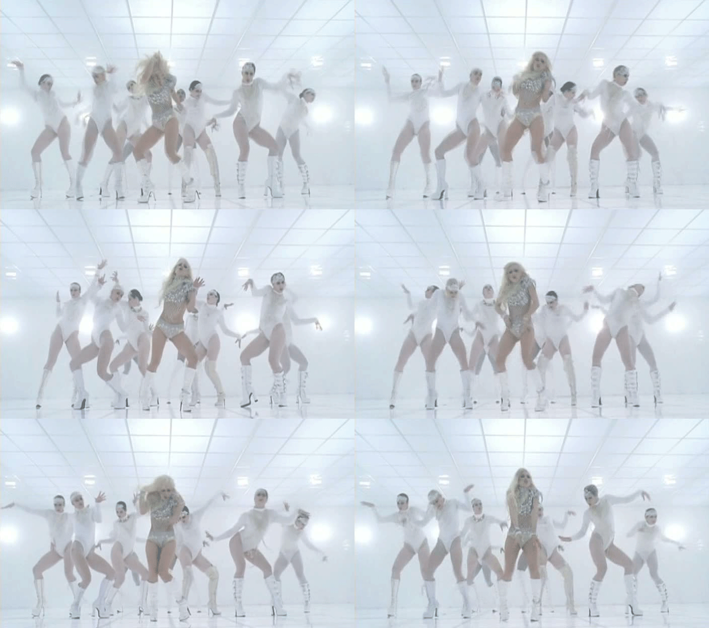
The lighting in our music video challenges the conventions of pop music videos in which the lighting is usually high key, soft white light (or coloured light for backgrounds). Our performance set-ups are lit very differently to this. Furthermore, the infinite white light in the hospital scene also challenges convention. Infinite lighting is not uncommon in pop videos, but it usually has much more playful connotations than our representation of a hospital, such as in Jessie J's Price Tag video. Having said this, we did take inspiration for our lighting for this set-up from Lady Gaga's Bad Romance Video, which is a pop video. Another big influence for lighting and mise-en scene though was Panic! at the Disco's video for This Is Gospel, who are a pop-punk artist. However, overall I believe that our lighting is more similar to that of indie or alternative videos. 


A gif of a clip from Panic! at the Disco's This is Gospel
A gif of a clip from Lady Gaga's Bad Romance


Something very unconventional throughout our campaign is how we never mention the lead singers name. We have done this in order to raise enigma and to make her seem more unpredictable and exciting for audiences.  

In conclusion, we have used, developed and challenged conventions so that our target audience will interpret our would interpret our video in a variety of different ways. This is very likely to happen because we have a large ranging target audience, who all consume music for different reasons, and for varied uses and gratifications. We want our audience to be left with questions, as we feel this creates enigma and a buzz around the artist. I think that this is suitable for our video as concept videos conventionally offer lots of different interpretations. This is augmented  by the fact that people interpret videos in different ways anyway, as Stuart Hall suggests, we cannot create a product will only one possible interpretation, we may only lead audiences to take that interpretation. 

Album cover

We took influence from this Strokes album. We liked the way in which is raised enigma and was an eye-catching image yet was ridiculously simple. 


However, this type of album cover could not work for two reasons. Firstly, it would not properly connote the genre of the band's music: pop albums conventionally feature the artist on the front whereas an image like this is purely alternative/indie. Secondly, it would not fit the brief as it would not fully establish the artist identity seeing as this is a debut album. 

(This GIF image shows the development in terms of conventions used
 in the album cover on the front and back)
On the whole, we stuck to the conventions of the album cover. There is eye-catching imagery on the front and back covers, and a motif runs throughout of water: this is synergy. The album name and artist name are on the front cover as well as on the spine, and the track listing, institutional text and bar and QR codes are on the back. The imagery is representative of the indie genre. There is a strong colour scheme of white, purple and red. 


There is also a theme running throughout of blank expressions. The inside fits to convention of the album revealing more to fans who buy the physical copy, by displaying the difference between the perfected band, and the stripped down band. 

Website


Early on in the project, I analysed some websites to get an idea as to what the conventions were, what works well and what does not. Below is an annotated screenshot of the strokes website. 


We have used similar conventions in our website. 


  • Social media links
  • Options to subscribe to newsletter
  • Based on album
  • Singles can be played
  • Merchandise available, which can be added to cart and purchased
  • Consistent colour scheme and fonts
  • Banner and menu remain consistent across all pages
In summary, we have used conventions with our website, rather than challenging or developing them.