Chaos Killed the Dinosaurs - You'll Find a Way

Music Video

Album Cover

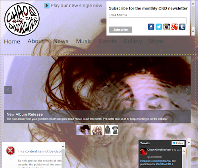
Website - click image to see full website

Wednesday, 18 December 2013

Promo Shoot

We needed to have a promo shoot to obtain a variety of photos of the band for our website. We tried to make each photo different and interesting by taking both group photos and individual shots of Arianna. We also tried using different props within the pictures, for example a stool and a microphone.

To make ourselves feel more comfortable in front of the camera, we began by putting on some music and having some action shots taken. We had two friends at our shoot to take the group photos, we felt this was necessary as our band unity needed to be clear on the website. We took a variety of group photos including some face-on with blank expressions, standing in a diagonal line and creating a formation around Arianna on the stool.
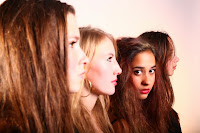
We also ensured we had lots of individual shots of our lead singer. It was essential that we had enough choice for the website that would create connotations of her craziness.
We decided to replicate the theme of red and black dresses that we used in the projection set-up of our video as these are our band colours. With Arianna in heels and the rest of the band in heavy black boots we ensured that our band image looked glamorous but still with a touch of grunge. Everyone had relatively neutral make-up except Arianna, who wore bright red lipstick to emphasis how she is different from the rest of the band.

We had difficulty with lighting the first set of shots. The area where the promo shoot took place was quite small, and inevitably some of us were blocking light and creating shadows on other members of the group. However we quickly resolved this by re-positioning the flash light and were able to achieve a nice light for the later photos.


Creating the Website

After creating our initial website flat plans, we began drawing up the basics on Wix, the program we used to create the website. 

To start with we created the task bar at the top, and the top strip and made this visible on every page as the start point and the basics to navigating around our band website. This included having the menu bar, our band name (logo) and the option to play our debut single and a small menu bar to link to other social networks, such as instagram and facebook to view our band pages on those websites.  


For the menu bar, we also wanted to create synergy with our main band colours, by including red in the menu bar; we did this by using a mouseover. On the website the menu words are just plain, but when the mouse is hovering over a word, it turns red. This helped to create more synergy with the website and our band.


Following this, we began to work on the homepage, and the main pages to give us a layout and a structure for the following pages. We decided to make the background of every page of the website, the image on our debut album cover to create synergy with our new album, and to keep the audience interested, and make the website look interesting and visual. The home page needed to attract the audience's attention and give some opportunities to interact with the band and explore the website. This was included by a slideslow of new news, including our debut album, a competition and available merchandise to buy. 


After setting out the main layout and structure of the home page, it helped our group to decide what the other pages should look like. This included ensuring every page was very visual, interactive and worked in synergy with eachother, and making sure there were links to different activities on other pages, for example on the events page we have a link to the competition page. On every page, we have also made sure that there is buttons to comment on facebook, like the page or write a tweet.


We did make a lot of changes from our original website flat plans, to ensure the website flowed well, and was interactive for the audience. Due to the website promoting the debut album and our new single, we also put the album image as the background image for our website. The website did go through a lot of changes to eventually be one we were pleased with, and thought our target audience would enjoy.


Tuesday, 17 December 2013

Album Cover Shoot

Ofter discussing many ideas for our album cover shoot, we finally were able to shoot our album cover and although some things went to plan, we did have a couple of problems to resolve.


For our album shoot, we took a variety of photos, including us individually and us as a group so can we could experiment with our idea and decide what looks best. In our group shots we took photos of us all looking at the camera head on, and also looking straight on turned to the side. 
We then took individual photos of us head on and sideways both dry and wet. We tried a variety of shots so that we could test out what looks best on our album cover. We also tried to make sure that we all had exactly the same shot and framing to create unity between the band. The wet photos were the most difficult to do, because we had to keep pouring water over our heads to make sure it stayed wet and looked consistent. 
We also chose to have neutral make up, with only a small bit of eyeliner and mascara on, with some neutral lip balm to create a very basic photo, but with the bare shoulders and a white background to make us stand out.
We had some trouble with lighting with all four of us in the shot, because sometimes some of us were cast in shadow, whilst others were overexposed. In the end we decided the individual shots were easier to light, so they could be edited together onto the album cover, with the same lighting on each band member.

Here is a link to problems faced on this shoot:

http://latymermusicvideo2013group4.blogspot.co.uk/2013/12/problems-faced-on-our-shoots.html

Problems faced on our shoots

We faced a few problems in each of our shoots, but on the whole managed to resolve them to make sure everything ran as smoothly as possible:

Album Cover Photo Shoot:

For our album cover shoot, our plan was to shoot the front cover in a bath. Our problem was lighting, we were not able to take photography lights home, and instead had to use lights normally used for filming and getting lights at the right angle not to reflect the water seemed like it might be a struggle, on top of the fact getting the lights wet was a hazard!
- We managed to rectify this by using only 1 light faced up at the ceiling and it lit the whole bathroom, including the bath, giving us the type of lighting in the shot we wanted. 


The rest of our shots for album cover were done in our school studio, and because we wanted some shots of us covered in water, we had to find a way to make sure we did not leave the studio floor soaking wet, or damage any equipment.
- We all brought towels in to wipe up any water, and put down on the floor to ensure the water did not spread and we mopped up any leftover water off the floor at the end of our shoot.


Brick Lane Video Shoot:

After having done our location reccie, we realised that some of our locations would be very busy on a Sunday so close to Brick Lane, because that is market day around the Brick Lane area. We also only had a limited amount of time for the days in Brick Lane, because we needed the shots to be light, and so we had to be finished by 16.30 and on top of that we had to fit in with our dancer's needs and work with him to make sure he was happy.
 - We ensured we had notified him months in advance of the days and times that we wanted him, and he confirmed early on, meaning that there were no concerns on the day and everyone knew when and where they were wanted. We also made a shoot schedule so we could make sure we took all our shots on time and to the schedule so that there was no fear of running past 16.30. 
- In regards to the number of people, many people realised we were shooting and just walked around us, whilst some thought we were selling equipment on the side of the road, so we had to ensure we kept an eye on all our things the whole time.


Studio Band Shoot:

This run quite smoothly other than the fact that we did not keep to our schedule at the beginning of the shoot because it took us longer to set up the studio, and do hair and make up than expected, so we had to try and get easy shots done more quickly in order to make sure we had enough time to get all our shots done and had enough time to work on longer shots.Alice, the drummer, was not used to the song and occasionally found it difficult to play to the beat.
- We were able to catch up on time later on and the shoot ran more quickly and smoothly than expected once we started getting into the swing of things. Although an extra 10 minutes was taken from the schedule to get Alice playing the drums to the beat, so that in the video she would not look out of time.


Hospital Scene Shoot:

We faced a similar problem of water on the studio floor, as in one the shots Arianna spits water at one of her nurses, and we had not brought towels along, so had to use coats and other items on the floor to make sure not too much water went on the floor. 

The bed we had bought for the studio was quite unstable, especially when we put it on two platforms to make it higher and Arianna was nervous that it would break.
- To solve this, we put tape around the bed, strapping it down to the platform, to ensure the bed would not fall of the platform and to make it more stable.


Our shoots

Here is just a range of shots we took in each of our shoots:

Our album cover shoot:


Our promo shoot:


Music video shoot: 


Initial website designs

We went through the development of our website, first drawing out basic flat plans of what we wanted our website to look like, and the different page designs, leading to what our website looks like now. 

 The picture on the left is one of our original home page designs, with our band name in large writing over the top of the home page followed by the menu bar underneath. We planned to have a large box with a slideslow of band photos, and a facebook and twitter feed either side of this for viewers to post and comment about the site and our band. The pictures help the audience to interact with the band and feel like they know a bit about them from seeing the photos.
On the right is a pop up we wanted when someone first looks at the website. We planned to have it as a round pop up, due to the shape of our logo, with pictures and news cut into the logo. You could then press click the small 'x' button to lead to the main website.


Following designing our home page, and pop up, we planned the layout of a few of the main pages, such as the gallery and the recent band news page. For the gallery page, we decided to have a main photo to click from each gallery that leads you to a large gallery of our band shoot, our video shoot. We liked the simple design and this design is exactly the same on our website now. For the news page we wanted to have main news down one side, with older news in an archive that could be opened up. Our plans for each page have influenced the website alot, although some have been adapted and changed to create synergy across all our pages and also just to be more fluid and interactive.

Monday, 16 December 2013

Feedback on Website

We had a group meeting today and decided it would be useful to get some more feedback on our website. These are the main points that were highlighted:
  • Back button on gallery needed
  • A contact page needed
  • Make sure institutional information is prominent
  • Ensure there is a variety of images and costumes
  • Clear opportunities for purchases and interactivity needed
  • Enable Facebook comments on everything
  • Create a Forum
  • Pre-order/Buy Now on merchandise
  • Dates need to be highlighted

Sunday, 15 December 2013

Album Cover Bath Shoot

Our final idea for our album cover was a CU of Arianna's face underwater. We decided the best way to do this was to use a bath tub. Conveniently, Ella had just the kind we needed, and so we booked a shoot at her house on Wednesday 4th December. 
We were worried that lighting would be an issue as we could not take the flash lights away from school, but we were able to use an arri redhead 650, a light usually used for filming, which ensured the bathroom was well-lit. As the space was quite tight, we had to be extremely careful when using the lights and camera around the bath. 
The shoot turned out to be a lot longer than we had intended, with frequent reapplication of make-up and false eyelashes needed. It was also more difficult than expected for Arianna to stay underwater without creating lots of bubbles which made those shots unusable.
However, we managed to get the shots we were looking for and therefore a re-shoot was not required. 

Here are some of the photos taken in the shoot:


Friday, 6 December 2013

Animatic

Instead of drawing out a key shots storyboard, we decided to make a titled animatic. We did this so that we could see where each shot would go in the video, how much time they would take up, and where the gaps were in terms of spaces without key shots or spaces with too little or too much of one set-up. We also drew out some of the most important shots so that we shared the same vision for these.

The colour coding for the Animatic is as follows:

Hospital
Dancer in brick lane
Grunge
Projection


Making the animatic was incredibly helpful in terms of the progression of the pre-production of the music video. When filming, we ensured that the band performance was particularly strong in shots that we knew we would use for that particular set up, and we took care to get good quality takes of all of our key shots.

Through making our animatic and through the editing process, we realised that we would confuse audiences by introducing all four set ups right from the beginning. Even the initial flashes of Kai (the dancer) were too confusing to start from 15 seconds in alongside hospital and grunge, two set-ups we definitely needed from the start. For this reason we decided to introduce the projection set-up at the beginning of chorus 1, and the dancer set-up at the beginning of the verse. We feel like this really helped to make the concept clearer to the audience than it otherwise would have been had we not made the animatic.

Sunday, 1 December 2013

Flat Plans for Album Cover

After having brainstormed and finally planning our album cover, we drew out these flat plans to ensure we collectively shared the same idea for all four panels. Also, once drawn out, we could check that our ideas worked, and could identify any larger or smaller problems we may have with our proposed idea. For example, after talking to media teachers and showing them these flat plans, we were realised that the front cover shot may be very difficult to light. This is because the bathroom is very small, and we could not use flash as it would reflect from the water. Furthermore, we could not take the photography lights out of school as they were not portable. In the end we bounced a fill light from the ceiling in order to light our subject evenly. When shooting out of water, we used a spotlight to give depth to the portrait. 

Front Cover


This image denotes a close-up of Arianna submerged in water, looking directly into the camera with a completely blank expression. Her make-up is perfect and her hair is flowing and voluminous in the water. The image is striking and has connotations of Arianna being powerful and bold, despite having a blank expression. The band name is at the top and bottom of the panel and the album name slanted at the side. 

Back Cover

In this image Arianna has seemingly come out of the bath, however now she is dripping wet and her make-up has run down her face. Again she looks directly into the camera and at the audience and she wears a blank expression, except to the audience she is no longer connoted as powerful, but much more vulnerable. The track listing appears next to her with the bar-code and record label logo at the bottom of the panel. 

Monday, 25 November 2013

Brick Lane Shoots on 17th and 24th of November

We had two on location shoots in Brick Lane, in which we filmed all of the fantasy/flashbacks involving Arianna and Kai (the dancer). We felt like this could work well as we did not want all of our shoots to be in the studio. Our first shoot was very tiring and we managed to film the vast majority of shots to a high standard. However, there were some that we were not happy with and that we realised did not work, and so we had a second shoot on the 24th of November. This shoot was very efficient, and we got everything done in three different locations within an hour and a half! 

Here are some photos of the highlights from both days:


Friday, 15 November 2013

Brick Lane Location Plans

These show the different locations that we decided to shoot at following our location reccie. This corresponds to the shoot schedule made in which locations are quoted with the same numbers. 


Shoot Schedule For Brick Lane Shoot 1


We made a shoot schedule for the On-Location shoot in brick lane with our dancer, which took place on Sunday 17th November. We took into account the diminishing sunlight hours we would have, and for this reason planned to start our shoot at 9. 


This meant that we would arrive at 8.30 to set up and do make-up, and could leave our houses at 7.30, giving our actors as much sleep as possible!
We did not plan the times of individual shots in Brick Lane as many were flexible with location, instead we planned out the possible locations for each shot, and whenever we ran ahead of schedule, we could shoot the more flexible shots. 

To see the map with images of these locations, click here

Saturday, 9 November 2013

Costume List

Grunge:
Ella: Light Denim Shorts, Black Sparkly top, black boots
Rakhi: Medium Denim Shorts, Black top with lace, black boots
Alice: Denim shorts, black crop top, black boots
Arianna: Black high-waisted shorts, bright orange crop top, black heels

Hospital:
Ella: Scrubs
Rakhi: Scrubs
Alice: Scrubs
Arianna: Straight Jacket and White Nightie

Projection:
Ella: Black sparkly dress, black boots
Rakhi: Black rainbow band dress, black boots
Alice: Black geometric cut-out dress, black boots
Arianna: Red lacy dress, black heels


Props List

Props List

Grunge:
Microphone stands x4
Microphones x4
Guitar
Bass
Amps x 2
Wires for Amps x 2
Drum Kit
Chains!!!!
Smoke Machine IS LOST
Scaffolding
Ladders

Hospital:
Syringes
Needle heads
Trolley/table
Straight Jacket
Chains
Bed
Mattress
Bed sheets
Blanket
Pillow
Pillow Cover
Pills
Pill Cups

Projection:
Guitar
Bass
Amps x2
Drum Kit
Projection Reel
Lights for lens flares


Friday, 8 November 2013

Test Shoot

We had our test shoot on the 7th November, in the studio, to test out our lighting and the whole mise en scene of our studio shots. We focused on the mental hospital scenes, to test out the cyclorama and because the hospital scenes have the most complicated shots.


We did a test shoot and after completing it we learnt:

- The lighting that worked - in our hospital scenes, the infinite white really works on the camera we are using, and in our band scenes the lighting looks good, but we need to adjust the spotlights on each band member because there was too many shadows and the spotlights were slightly too dark.

- It took us 3 hours to set up the studio before we started filming, however it will be quicker when we do it for the real shoot, because we have had practise but we have to make sure we are efficient in setting up the studio to ensure we have enough time for shooting all 3 studio set ups.

- During our test shoot for the projection set up, we have lens flares either side of the projector, and we have to change the position of the bass and guitar players in the band because they were getting in the way of the lens flares, so we have had to rethink the set up of our band when they are performing.


Our group was really pleased we did a test shoot, because we now feel more positive about the real shoot and are happy with the mise en scene and lighting for most shots. We also got practise on the camera we will be using, so got ready for working with that and learning all the settings as well as practising using the dolly for moving shots, to make sure we get a lot of variety in our shots.

Wednesday, 6 November 2013

Logo Development

When creating the logo, we had a clear idea of a rough image: we wanted graffiti style text for an edgy urban feel, warped into the shape of a circle, however, details and additions to this design came along the way. The following pictures demonstrate the process we went through in the making of our logo:
This is the initial font with only a text warp; this was not round enough for the effect we were trying to achieve.
We used a free transform warp to create a slicker, circular text which was still legible, having reached the initial idea however, we decided this was too plain.
Since our band name is derived from an adapted movie quote not an affection for the extinct creatures, we did not want to affiliate ourselves too much with their image, however, to give the logo more depth we thought we would add the shadow and outline of a dinosaur, using a clipping mask, to just the text not the space in between. This makes our logo more eye-catching as it is not immediately obvious what the overlaid image is.
The final logo
To  reinforce the edgy urban feel, we erased the edges of the font slightly so it looked more like graffiti and added a black circle outline for a slick finish and so it looked like the font was bursting out of somewhere instead of just being round which reflects the larger than life attitude of our lead singer.